


")


")


In an era of information overload and media fragmentation, this experimental typeface transforms discarded newspapers into a powerful expression on how we consume news today.
________________________________________________________________________
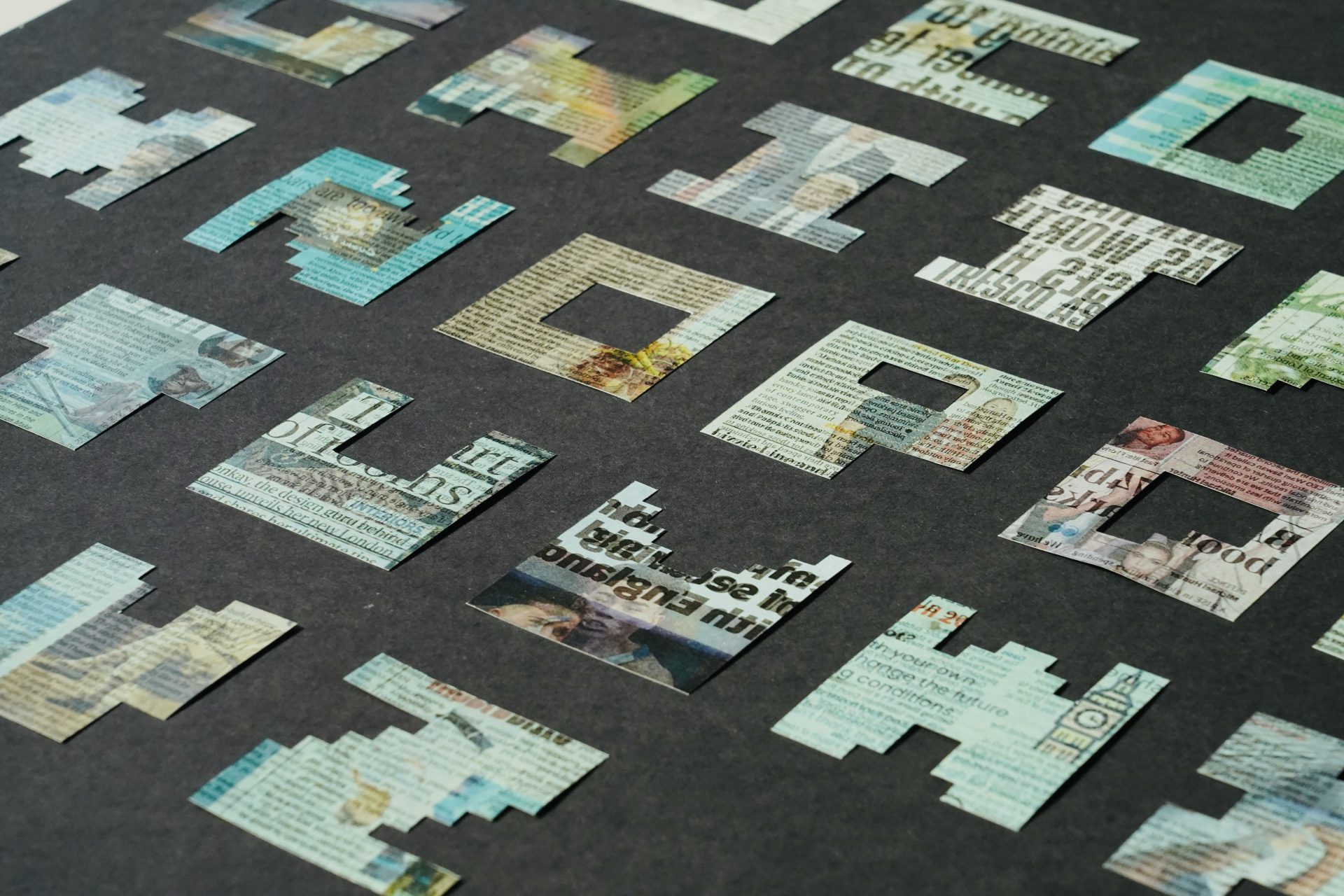
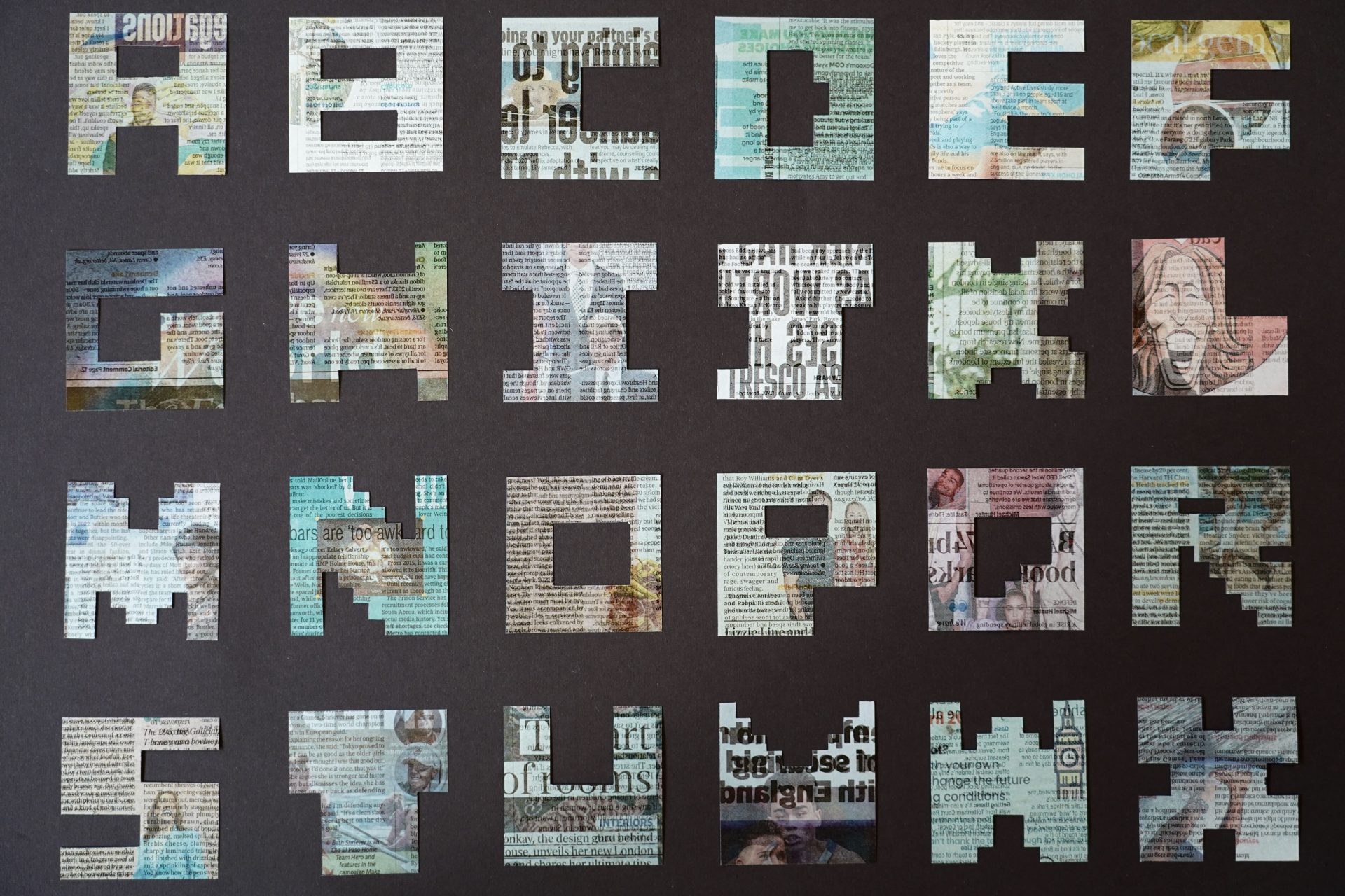
The design begins with identical newspaper squares, systematically removing exactly 20% of material from each to carve out individual letterforms (two photos shown below).
The deliberate 20% removal serves as a visual metaphor for the information gaps inherent in contemporary news media: the missing context, omitted perspectives, and editorial choices that shape our understanding of events.
 _______________________________________________________________________
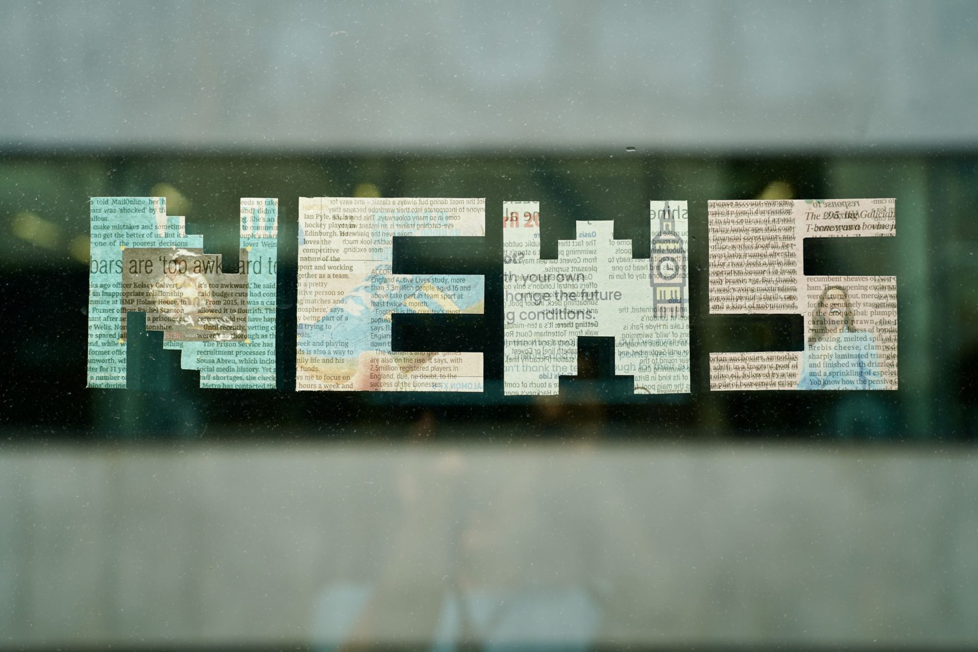
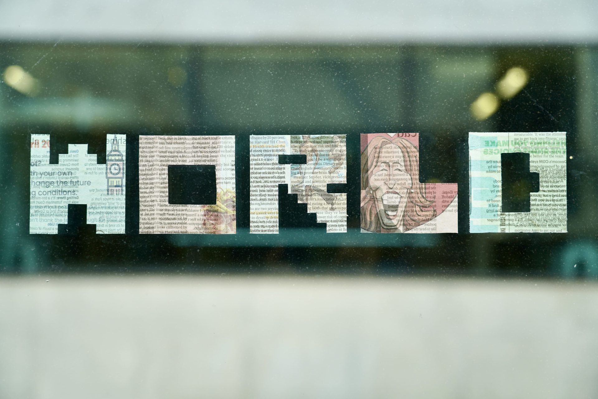
The physical installation adds another layer of meaning: letters are dampened and adhered to windows, creating translucent forms visible from both sides. This transparency invites viewers to see through the text, encouraging them to consider multiple perspectives (two photos shown below.)
******


